As we discussed in Part One of this series, anyone who’s done some DIY home decorating can attest to having one or more projects that never really came together, while others seem to work better than expected.
A common reason for whether or not a home décor project inexplicably comes together, or never quite worked, is the pallet of colours used throughout the room.
While there are no steadfast rules as to which colours work together and which ones won’t (there are too many other factors that affect the look and feel of your project, including textures, and colour shades and tones), having a basic knowledge of colour theory will increase your chances of getting pleasing results from your room renovations.
Colour Theory
If you haven’t already, please check out Part One to learn more about the basics of colour theory, including how the colour wheel helps you apply the theory, and what are the primary, secondary and tertiary colours on the wheel.
Colour Harmony
Known most for its use in music, the broader definition of harmony means a pleasing arrangement of parts. The Beatles had great vocal harmonies, Toronto’s City Hall is famous for its architectural harmony and your room’s décor will have a tough time being successful without colour harmony.
There are three basic ways to get colour harmony, using a basic colour wheel of 12 colours.
1. Use Analogous Colours
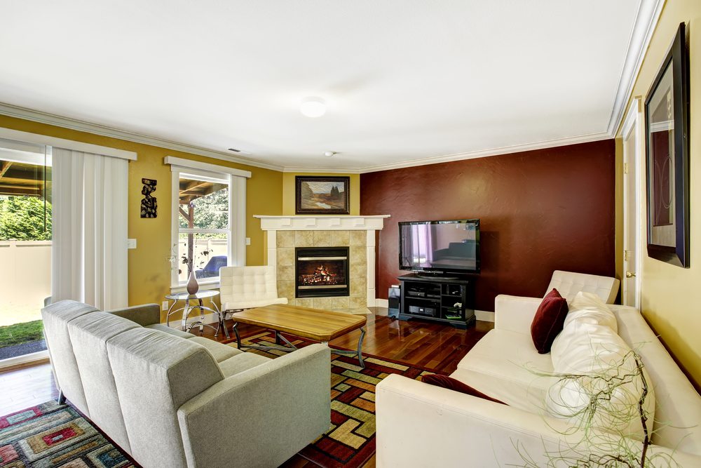
Two or three colours that are side-by-side on the wheel are analogous. Yellows and greens, reds and oranges, and blues and purples are analogous. Before you start wondering how you’ll ever get red and orange to work in a room, remember some of the other factors that come into play in colour theory, like colour tone. And one colour should be dominant. So red/orange harmony would happen in a room of earth tones.
2. Use Complementary Colours
Colours that are directly opposite each other on the wheel are complementary to each other. These include blue and orange, and red and green. Complementary colours are a good chice if you want a room of high colour contrast.
3. Try a Monochromatic Scheme
While not particularly related to the colour wheel, many rooms come together nicely when different shades and textures of the same colour predominate – but you’ll probably need to break up the monotony with some elements of an analogous or complementary colour.
If you would like to learn more about colour theory, or you just want to skip it all and go straight to getting expert help with a colour scheme for your next home redecoration project, be sure to check out The Paint People’s Colour Consultation Services.