Colour Trends 2016 & Colour of the Year OC-117 Simply White!
Benjamin Moore 2016 Colour Brochure
If you’re like me, you’ve already broken your 2016 resolution to eat healthier and go to the gym, (which I think is record time for me) but let’s not dwell on it, let’s look to the better things of this year like the exciting new collection of Benjamin Moore’s 2016 colour trends. While the 2016 Benjamin Moore colour trends have been available for a few months now, it is officially applicable for the New Year! 2015 was good but 2016 will be that much better with a renewed ideas for your new home. A lick of paint can be the Christmas gift to your home that you just didn’t quite get around to last year.
So we’re saying sayonara to 2015 colours and hello to the fresh new face of 2016: Simply White! But before we jump right into Benjamin Moore’s 2016 colour trends, let’s take a moment to reflect on what worked, and what didn’t work from the 2015 palate.
There are a handful of colours that continue to prevail as tried and true colours from the 2015 selection, like 2108-50 Silver Fox and OC-46 Halo.
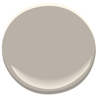
2108-50 Silver Fox
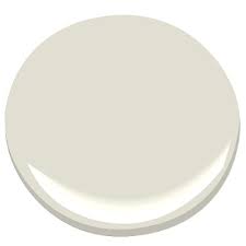
OC-46 Halo
The silver fox continues to act as a good neutral between a gray and beige, leaning more toward the gray. The medium dark tone of the silver fox is ideal for open concept spaces that need colour and depth. The OC-46 Halo on the other hand is a colour chosen from the off-white’s collection, a style choice that is quite popular for this year. The OC-46 Halo colour is a balance of a fresh flavour of green, filtered with a hazy gray film to create a translucent, calming yet lively off white hue.
Surprisingly what didn’t seem to work as well in 2015 was the darker shades of green like the CC-620 High Park and its opposing strong colour of red, 2113-40 Cinnamon Slate.
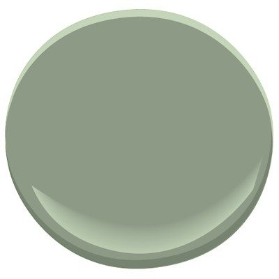
CC-620 High Park
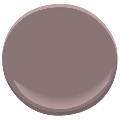
2113-40 Cinnamon Slate
These colour tones didn’t coincide with the off-white movement, or connect to the grays of the neutral palate. These types of colours feel out of place with the direction of style that is bleeding through into 2016.
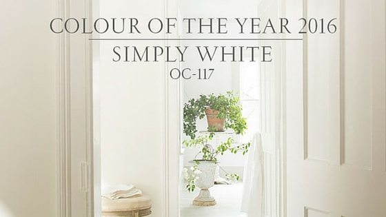
2016 is a clean slate and an opportunity to bring your home into this fresh faced era! And what better way to do that, than with Benjamin Moore’s 2016 colour of the year… Simply White! On the surface, the OC-117 Simply White may appear ‘simple’ for the colour for the year, but the truth is, this slightly warmed white hue can become a fundamental colour to establish a variety of styles. Simply White is a vivid and bright white, which makes it versatile to pair with many shades of colours. It reflects a modern, linear lifestyle that can be warmed with materials, layered for texture or contrasted with bold, striking colours.
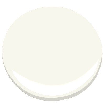
OC-117 Simply White
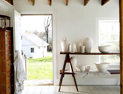
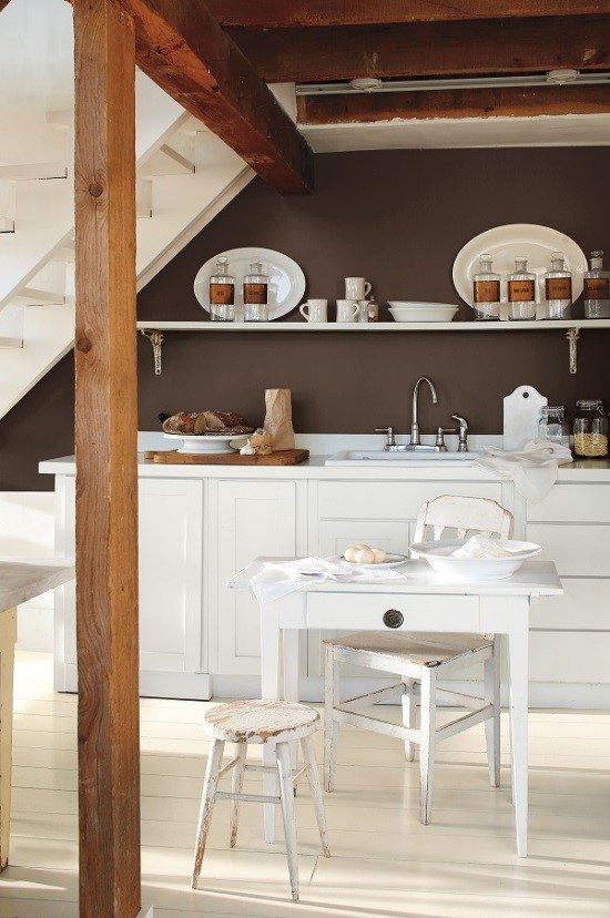
white-washed walls,
hand-hewn beams…
texture
In the ceramicist’s studio, harmony reigns.
Coats of white paint refresh rustic boards and beams and take on a warm, soft glow.
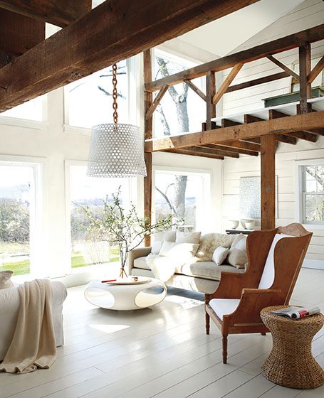
layered whites,
diffused light…
ambience
Surrender to the complexity of white. In this abstract artist’s townhouse, the interplay of whites and light creates nuance and subtle beauty.
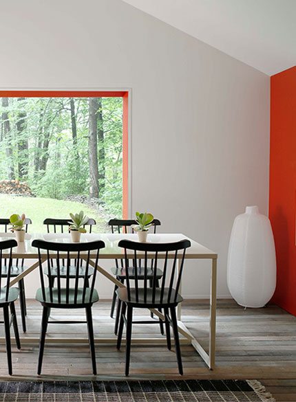
striking contrasts,
bold lines…
definition
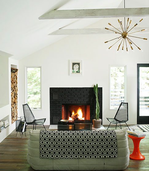
Angles and edges become sharply defined as white is cut with black. This digital designer’s cabin conveys intent, celebrates form, as fearless, high chroma colors punctuate the black and white landscape.
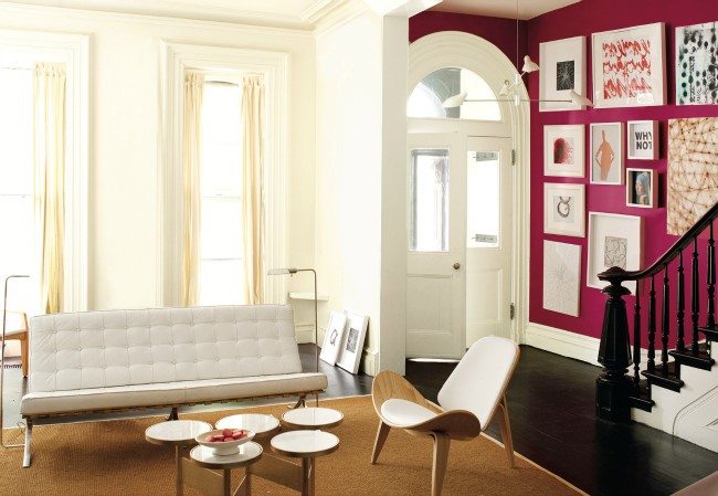
One of my favourite picks from the 2016 Colour Trends collection is the 2076-20 Royal Flush. This vibrant jewel-tone pink has an electric combination when paired with an off-white. The characteristic of this electric colour could be swapped for a different hue. For instance a navy blue like Benjamin Moore’s 2035-10 Old Navy from the Dramatic Deep Collection, would have the same affect; the white becomes the backdrop and the colour becomes the focal point.
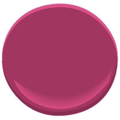
2076-20 Royal Flush
OC-117 Simply White
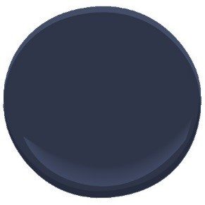
2035-10 Old Navy
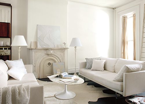
energizing color,
crisp white borders…
focus
White frames and flatters. In this gallerist’s brownstone, white is the guide that directs the eye to multiple color encounters.
Conversely, a great colour choice, that isn’t, well, as colourful, would be AF-170 French Press, from the 2016 Colour Trends collection. Benjamin Moore’s French Press is still a strong opposing tone of colour to pair with a white or off white, however it performs as a neutral. I’d recommend a colour such as this, where you don’t necessarily want to commit to a specific colour. Colour can always be introduced and even interchanged through accessories, against a neutral. More importantly, whites coupled with different neutrals, including layering whites, creates texture and ambiance.
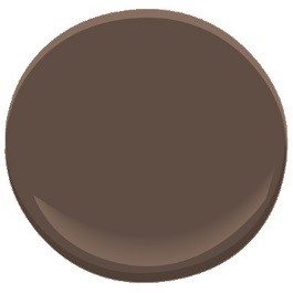
AF-170 French Press
Colour Trends 2016
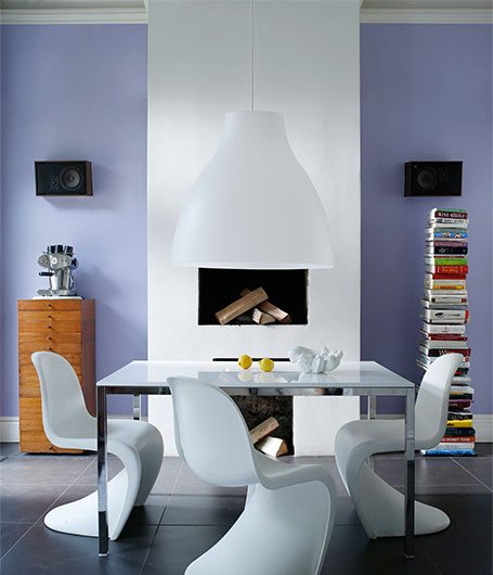
Benjamin Moore dictates colourful yet tasteful hues for 2016, from cobalt blues and lively pinks to subtle grays and cozy browns. The beautiful aspect of Benjamin Moore’s bright but gentle, Simply White as colour of the year, is, it’s versatile and harmonizes with almost any colour and any style. So, start the New Year off with a splash of white, and maybe if you’re a little daring, some colour too!
Sahra McFarlane
Interior Decorator
Creative Haus Designs