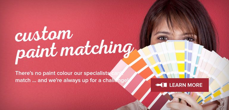
Colour Harmony
Benjamin Moore’s Affinity Colours eliminates the struggle of pairing coordinating colours together. Have you ever been in the position, where you’re trying to harmonize paint colours, but one just doesn’t seem to mesh well with the other? One of the hardest parts of choosing colours, seems to be matching colours, whether it be between rooms or multiple colours in one room.
The Affinity Collection is not the newest addition to Benjamin Moore’s Colour Palate by any means, however it tends to be looked over when there are so many other known colour choices offered by Benjamin Moore. While the Historical Collection and Designer Classics are just some of the tried and true colour selections, the Affinity colours deserve some attention. The Affinity collection offers a service, if you will, within its selection that is unique to solely Affinity colours. The Affinity colours are built to work in congruence with one another.
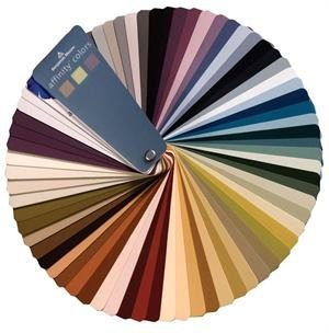
The beauty of the Affinity Colour Collection, is there are 144 individual colours that have been specifically formulated to be paired and used in combination of any three and the palate will work. By ‘work’ I mean it will harmonize from room to room, or in combination within one room. How is this possible you ask? Well, there are three factors that comprise of how a colour works well together: HVC Hue, Value & Chroma.
The Science behind the Affinity Colours
We’ve all had that moment when we choose a colour and we’re trying to match, one that ‘goes’ with it, but automatically we know they do not blend. The complete science behind that can comprise the content of an entirely different subject, but the thick of it – without delving too much into the science — is that the Affinity colours are made up of three components, Hue, Value and Chroma H/V/C.
The hue refers to the colour, the difference between seeing red, blue, green or yellow on your walls. The value indicates the lightness or darkness of a colour. For example, the colour blue can be dark blue, like the AF-565 Mysterious
or light blue AF-540 Constellation.
While this is of the same hue the value of that one colour is different. The last quality perceived is the Chroma. This is a term hardly used in typical colour conversation, however it is certainly one of the most important factors in choosing colours that harmonize well together. The Chroma represents the dullness of a colour. It isn’t what many people consider to be how much gray is IN a colour, rather how vibrant or muted a colour appears. For instance, the same colour blue that we mentioned, can appear to be a vibrant, bold blue, or it can be a soft, watery blue. While all other factors of this blue can be the same, the intensity of a colour can differ from the most vibrant shade of that hue to the dullest shade.
The Affinity Colours share at least one of these attributes to its counterpart colour. If you were to randomly select any 3 colours, they each share one or more of these qualities, and while I’m not recommending to randomly select 3 colours to employ in your own home, the theory does apply. In fact, I’ve tested this multiple times, specifically choosing the worst colour combinations I could think of, and while it may not be my first choice of colour pairings, I can agree the colours do flow well from one to another.
How & Where you Can Use Affinity Colours
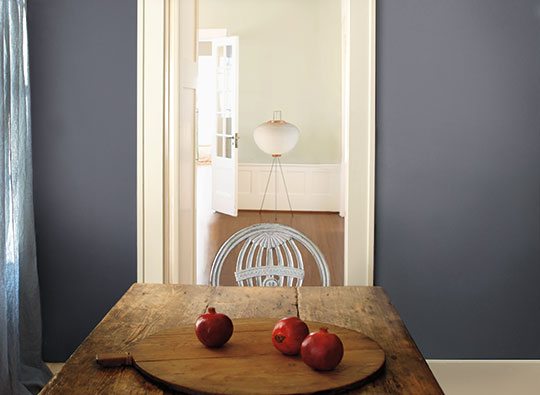
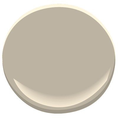
The Affinity colour selection can be utilized on many scales; it can become the colour palate for one room, for example an accent wall, trim, and main colour. While this is one version of how the Affinity could be employed, I’d recommend to take advantage of the service, of the perfect parings, provided within the colours and apply it on a larger scale of your home. For instance, instead of using three colours in one room, use three different colours in three different rooms, to maximize the flow from one room to another. The hallway, living room and kitchen could be considered three separate rooms, and by applying the Affinity colours to the majority of the main floor, you’ve ensured harmony from front door to back door. And why stop there? Technically you can take it further, and apply the same rules to the upstairs. For example the hallway colour typically drifts up the stairs and becomes the upstairs hallway. Potentially you can choose bedroom colours off the chosen hallway colour as well. While the Affinity has a great cohesive palate, the 144 colours does not compare to the 1000’s of colours from the Colour Preview section. While the Affinity palate is limited in the variety of colour selection, it’s a great option for a selection of colours that doesn’t feel as overwhelming. One of the benefits of the Affinity colours is, it has a versatile collection of neutrals. The selection ranges from pure beiges to pure grays and all types of greiges in between! One of my favourite grays from the Affinity collection, is AF-690 Metropolitan.
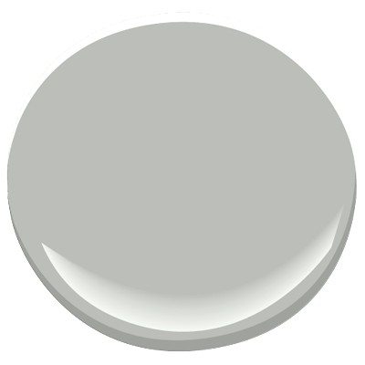
AF-690 Metropolitan
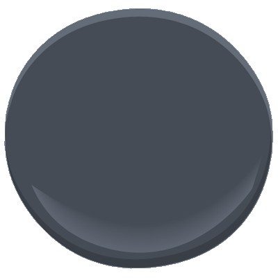
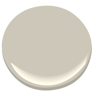
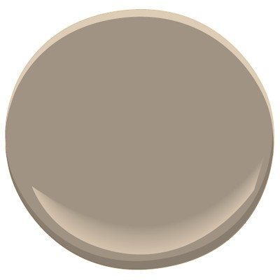
It’s a slightly lighter version of the well known and loved Coventry gray, which could at times, come across too dark. Comparably, AF-685 Thunder and AF-100 Pashmina
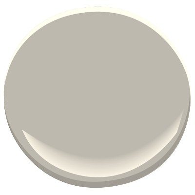
AF-685 Thunder
AF-100 Pashmina
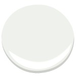
appears to be similar versions of the popular HC-172 Revere Pewter;
HC-172 Revere Pewter
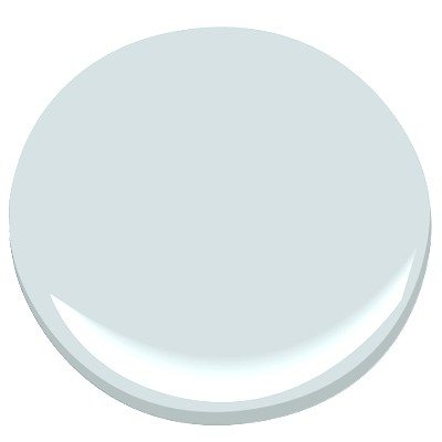
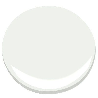
the Thunder a little bit more gray and the Pashmina leaning towards the beige. Some of the lighter hues include AF-5 Frostine,
AF-5 Frostine
which could be utilized as a crisp white for trims, and AF-65 Fossil
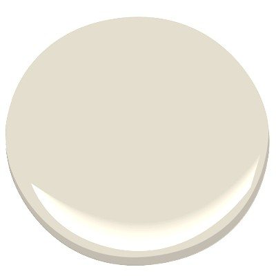
AF-65 Fossil
a soft creamy colour perfect for off white walls.
The Affinity colour chip cards are made slightly larger for easy viewing, and compared to the colour preview chips, they’re presented in single chip colours, versus sharing 3-4 colours on one chip. Not only does the Affinity collection of colours provide the perfect pairings for three colours, they can also be an excellent choice as a singular colour. AF-290 Caliente
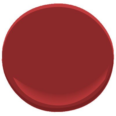
AF-290 Caliente
is one of my favourite reds from the entire Benjamin Moore collection, as is the warm and cozy, milky brown of AF-155 Weimaraner,
AF-155 Weimaraner
both of which would look phenomenal used on its own.
Affinity Colour Collection Winning Combinations
1.
AF-5 Frostine
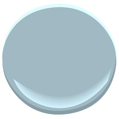
AF-515 Exhale
2.
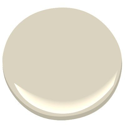
AF-80 Jute
AF-515 Exhale
AF-100 Pashmina
So the next time you find yourself struggling to match colours for your home, or even one room, turn to the Affinity Colour Collection. These colours have been specifically formulated to harmonize together, no matter what combination of three colours you choose. It’s arguably the easiest way to synchronize colours throughout your home!
Sahra McFarlane
Interior Decorator
Creative Haus Designs