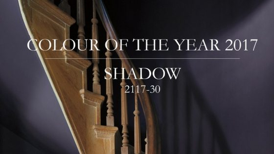
Colour Trends 2017 & Colour of the Year 2117-30 Shadow
Colours of 2016
We’re excited to finally delve into Benjamin Moore’s colour trends palette for 2017. Let’s first take a moment to reflect, one last time on what worked well from the 2016 colours. The 2016 series was inspiration to the concept of how to use whites, based on the 2016 colour of the year OC-117 Simply White. The colour was exhibited through different methods of how to use in design, like layering white on whites, adding punches of colour or pairing it down with neutrals . The remaining 2016 colours included muted primary colours, like the 2022-40 Banana Yellow and 2076-20 Royal Flush, which realistically appeared to be the least popular choices throughout the year, where the off whites and pastel shades excelled.
Colour Trends 2017
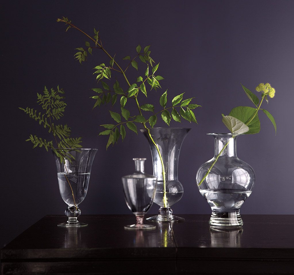
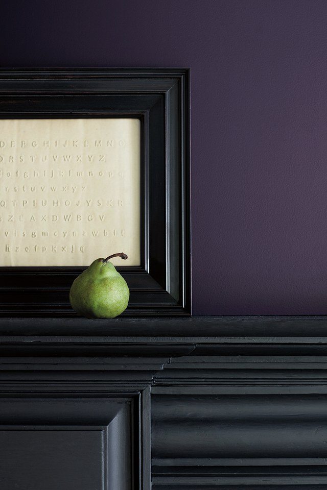
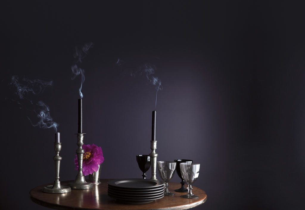
As for the New Year, we encounter a distinctive and mysterious hue; 2117-30 Shadow. What a contrasting difference from the unadorned off white colour previously chosen last year! Shadow is a significantly darker tone, bathed in a subdued purple hue that projects a noble yet sober atmosphere.
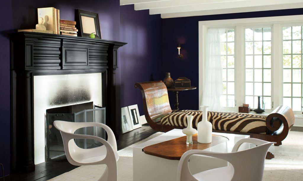
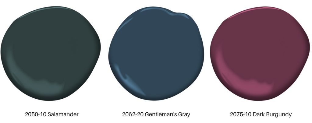
In comparison the 2017 colours takes a surprisingly darker tone throughout the palette. The series is infused with deep, moody shades layered into rich and decadent colours, like the 2050-10 Salamander, 2062-20 Gentlemen’s Gray and 2075-10 Dark Burgundy.
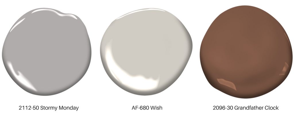
Neutrals are also scattered throughout the collection, in both grays and beige’s, for example the 2112-50 Stormy Monday, AF-680 Wish and 2096-30 Grandfather Clock Brown.
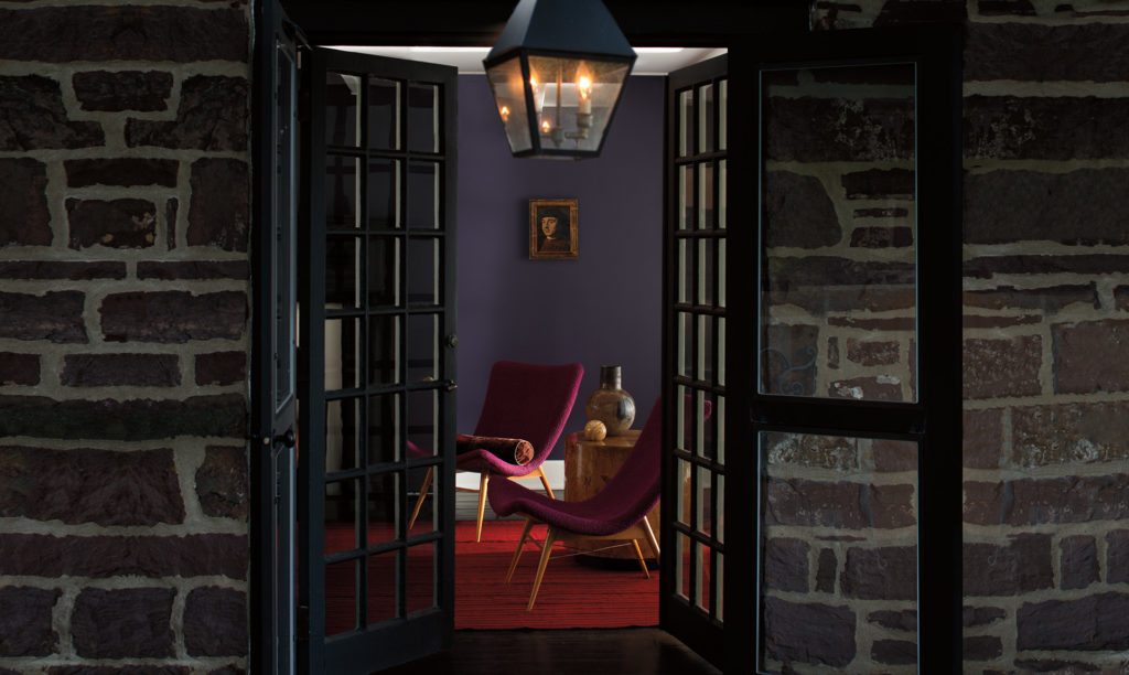
A notable trend in the 2017 colour collection, is the prevalent pinkish-purple undertones found throughout, which emit a luminescent and warm impression. Previously, cool whites and grays were prominent colour choices, but the disadvantage is they doesn’t always transfer idyllically to every space.
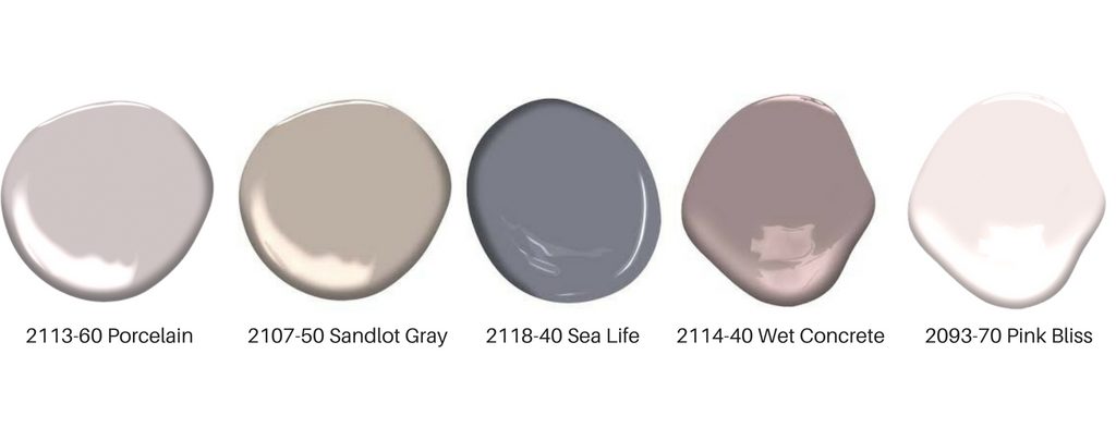
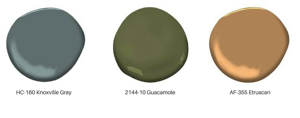
The elusive shades of the pink and purple toned hues, inherently complement the colour of the year, and the remaining colours are equally flattering shades of blues, greens or yellowed oranges, also purposefully harmonious.
Benjamin Moore’s 2017 colour trends takes a sophisticated stance, all the while maintaining a chic disposition. This year, it’s go dark or go home! The off whites can become static, whereas the inherently dark and restrained colours is a classic choice that creates naturally temperate ambiance. From the forgiving qualities of the supple whites, to the confiding, languid hues that seem to dissolve into the walls, and all the shades in between, 2017 is entertained with colour possibilities for all year round’!